Shortly, you will receive notice on program opening that there is a new version of .Pro available and asked if you would like to update. It is always a good idea to say “yes” to that question. Two reasons: 1). Sometimes the update fixes a bug. You can save yourself the frustration by just updating. 2). We add small changes to the program periodically which are really quite nice.
We do have two times a year that we usually make some massive change or addition to functionality or underlying biological equations (if the model has changed). Those occasions are heralded by announcements and a new things PowerPoint at start-up. We target March and October for those releases. Development is continual—sometimes the addition or change is so wonderful (or so easily implemented) or such an improvement(!) that we incorporate it into a minor release, not waiting. The latest updates in the AMTS.Cattle.Pro fall into both the (oops) buggy fix and the “isn’t that spiffy” categories.
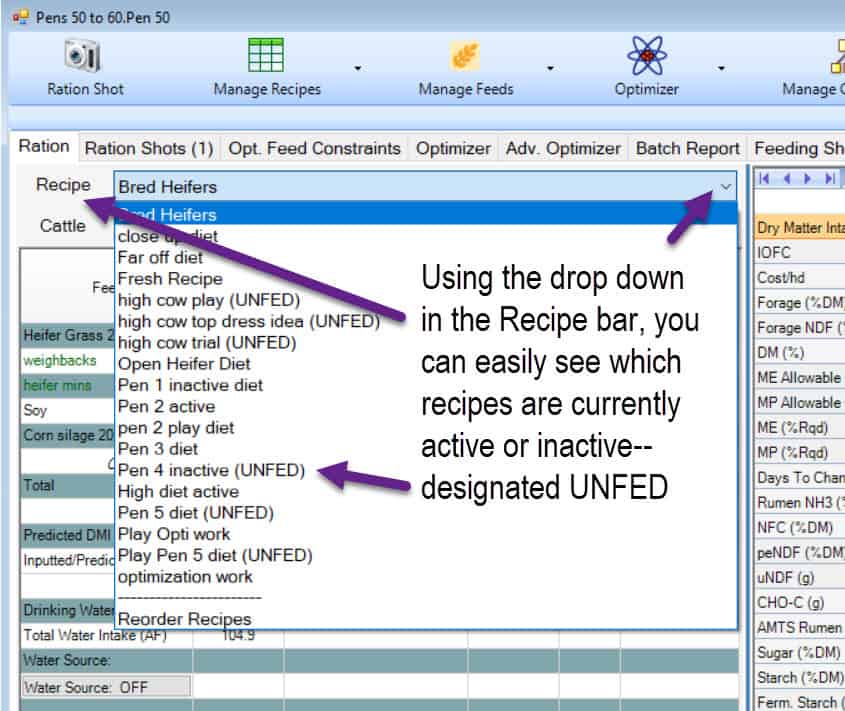
Not wishing to dwell on bugs, let’s go right to the spiffy. Users sometime accumulate lots of recipes in their farms; especially if they have had the program a while and been feeding the same farm for years. As a result, it can be a little confusing when trying to suss out which recipes are active. We had this request from customers (I am looking at you, Steve) and it made good sense. Lynn and I asked for the unfed recipes to be colored grey, like they are dead, but saner and clearer minds prevailed.
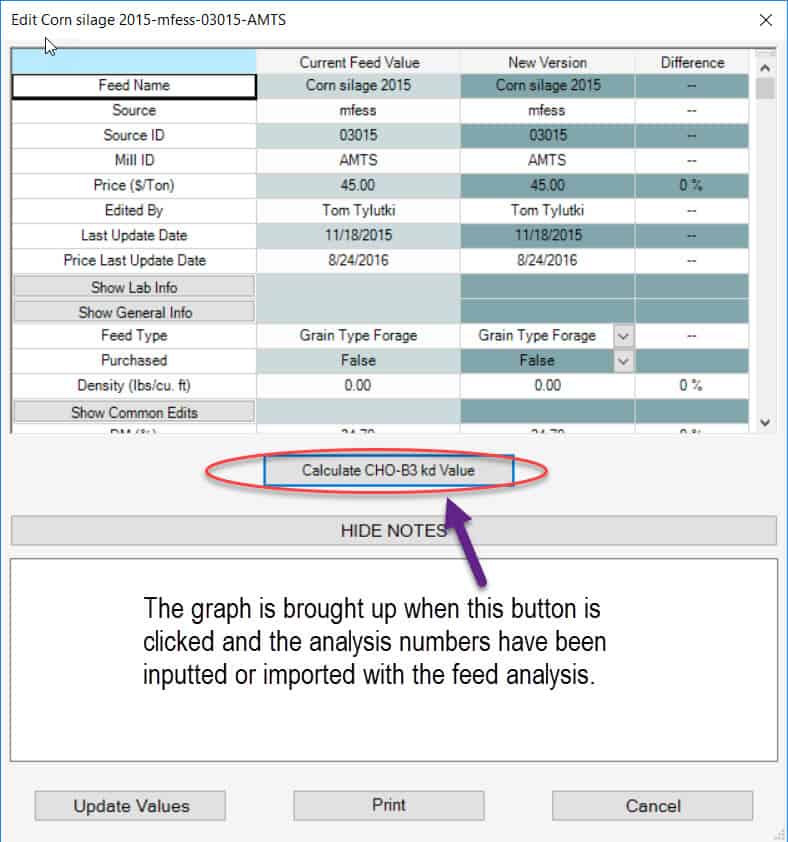
This next one is especially lovely—If you use the CHO-B3 calculator for forage and non-forage fiber source analyses, the rate and curve is now shown on a delightful graph. We quite like it. The graph is shown on the Feed Edit screen when the numbers have been supplied through analysis and Calculate CHO-B3 kd Value is clicked
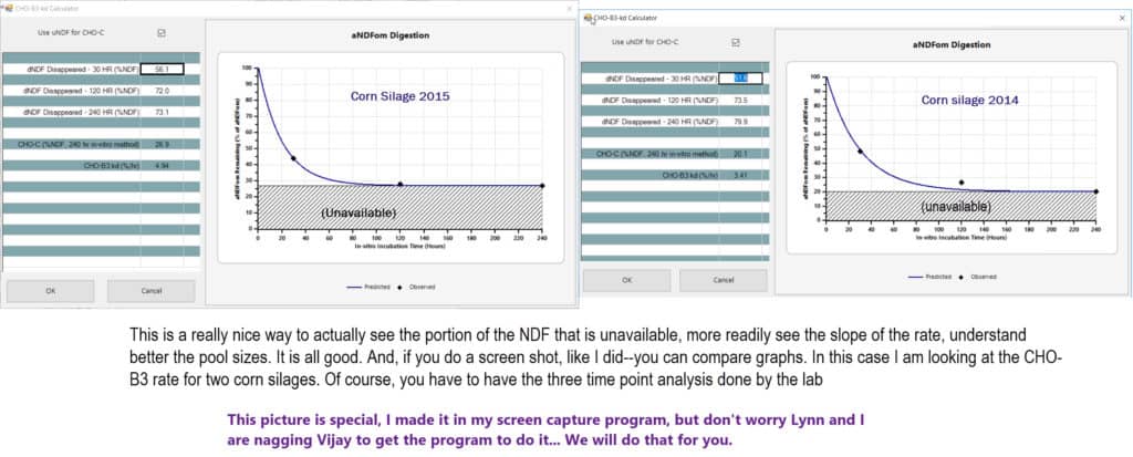
This is a screen shot of two different corn silages to compare the graph. By the way, since these were taken, Vijay has added a print option so you can print off the charts. You cannot compare two, side-by-side as I have, YET….
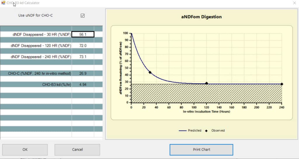
The Print Chart button on the bottom of the page will print only the chart (not the actual data) I have yellow highlighted the part that is printed in the image below.
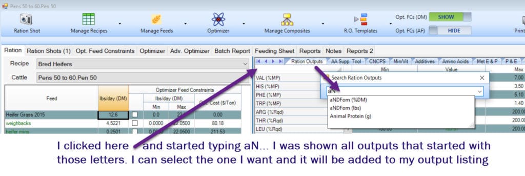
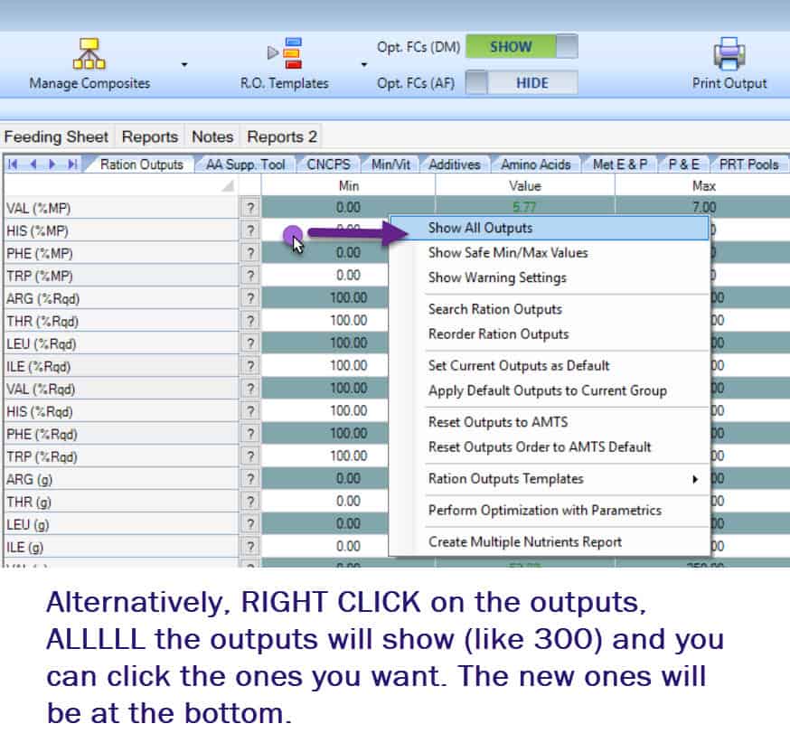
There are new ration outputs that you may wish to bring into your templates. They are: aNDFom (kg), TFA (%DM), Forage (kg), Allowable Milk (5BW), Microbial MP (%MP), and Forage uNDF-30HR (kg). Remember, new outputs do not automatically show up in your outputs you must either search for them EXACTLY as they are named in the search outputs screen or right click on the outputs screen, select Show All Outputs and look for them at the very bottom of the screen.
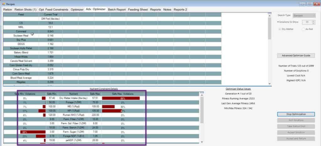
One other, small thing that deserves noting: We LOVE the new genetic algorithm advanced optimizer. One of the things we really like about it it that as the optimizer runs and “breeds” better diets, you can see which nutrient constraints are presenting the most challenge by the colored bars at the bottom. Those bars show the percent of diets that are being held back by that particular nutrient and provides some understanding to the nutritionist regarding where some wiggle room can be gained, and what was presenting the most conflict. When Vijay set it up, he, arbitrarily, chose green for the bar color. We noted when demonstrating that users were misinterpreting the bars to be a POSITIVE thing–strictly because of the color green. We are hardwired to think GREEN–GO. We asked Vijay to change the color. Now they are red, not an alarming red, like “this diet is bleeding” or “this diet should be burned” but more of a brick red, like “this is what is stopping you”
A complete update list can be found through Help>View Updates List in the program.